In this second article about the Kaggle Titanic competition we prepare the dataset to get the most out of our machine learning models. Therefore we clean the training and test dataset and also do some quite interesting preprocessing steps. In the first article we already did the data analysis of the titanic dataset.
You find the whole project with all Jupyter notebooks in my GitHub repository.
Import all Libraries
# pandas: handle the datasets in the pandas dataframe for data processing and analysis
import pandas as pd
print("pandas version: {}". format(pd.__version__))

# numpy: apply high-level mathematical functions
import numpy as np
print("numpy version: {}". format(np.__version__))

# matplotlib: standard library to create visualizations
import matplotlib
import matplotlib.pyplot as plt
print("matplotlib version: {}". format(matplotlib.__version__))

# seaborn: advanced visualization library to create more advanced charts
import seaborn as sns
print("seaborn version: {}". format(sns.__version__))

# turn out warnings for better reading in the Jupyter notebbok
pd.options.mode.chained_assignment = None  # default='warn'
Like you already know, the first step in every notebook is to import all the Python libraries that we need. I recommend printing the version of the installed library to the notebook, because for debugging reasons it is useful to know what version of a library you use.
For the main part of the data cleaning and preprocessing I use standard libraries:
- We use pandas (version: 1.3.1) as universal tool to manage our datasets as pandas dataframes.
- Numpy (version: 1.20.3) is used as high level mathematical library when we do the feature scaling.
- To visualize our data we use the combination of matplotlib (version: 3.4.2) and seaborn (version: 0.11.1).
Also I like to turn off all warnings to make the reading of the notebook easier.
Load the Processed Training and Test Dataset
df_train = pd.read_pickle('../02_dataAnalysis/df_train.pkl')
df_test = pd.read_pickle('../02_dataAnalysis/df_test.pkl')
Now we load the training and test dataset that we saved as pickle file after the data analysis. If your folder structure is different from mine, make sure that you change the path to the training and test file.
def pivot_survival_rate(df_train, target_column):
    # create a pivot table with the trget_column as index and "Survived" as columns
    # count the number of entries of "PassengerId" for each combination of trget_column and "Survived" and fill all empty cells with 0
    df_pivot = pd.pivot_table(
        df_train[['PassengerId', target_column, 'Survived']],
        index=[target_column],
        columns=["Survived"],
        aggfunc='count',
        fill_value=0)\
        .reset_index()

    # rename the columns to avoid numbers as column name
    df_pivot.columns = [target_column, 'not_survived', 'survived']

    # create a new column with the total number of survived and not survived passengers
    df_pivot['passengers'] = df_pivot['not_survived']+df_pivot['survived']

    # create a new column with the proportion of survivors to total passengers
    df_pivot['survival_rate'] = df_pivot['survived']/df_pivot['passengers']*100

    print(df_pivot.to_markdown())
    return df_pivot
At the end of the data analytics script, we saved the training and test dataset as pickle files. To get our training and test datasets pack as pandas dataframes, we read the pickle files from the disk. Because we will create new features during the data preprocessing, I also copied the function pivot_survival_rate that we created in the data analysis notebook to plot the survival rate as pivot function. The only difference is that I add the return of the pivot table because we will need the pivot table in a later stage of the notebook. In all cases, where we do not need the result of the function pivot_survival_rate we use the underscore sign as dummy variable.
Feature Engineering (1/2)
The objective of feature engineering is to prepare the input datasets that the machine learning algorithms can work properly with the input data and also improve its performance regarding runtime or/and accuracy. The main task of the feature engineering is to create new features based on the features that are provided with the dataset.
Important for Feature Engineering
Important is that all new features must be computed for the training and test dataset, because during the training of the machine learning algorithm, you create a function that depends on all input features. When you evaluate or predict an outcome, based on the test dataset, the algorithm will look for these features in the test dataset.
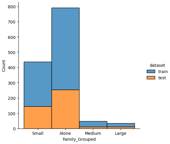
New Feature: Family and Family_Group
def get_family(df):
    df['Family'] = df["Parch"] + df["SibSp"] + 1

    family_map = {
        1: 'Alone',
        2: 'Small',
        3: 'Small',
        4: 'Small',
        5: 'Medium',
        6: 'Medium',
        7: 'Large',
        8: 'Large',
        9: 'Large',
        10: 'Large',
        11: 'Large'}
    df['Family_Grouped'] = df['Family'].map(family_map)

    return df

df_train = get_family(df_train)
df_test = get_family(df_test)
A major part of the feature engineering is to create new features, based on the ones that are currently in the dataset. The first two features that we will create are “Family” and “Family_Grouped” that define the family situation of a passenger based on the number of siblings or spouses (“SibSp”) as well as parents and children (“Parch”).
Because we compute the new features for the training and test dataset, we create a function that we apply to the training and test dataset.
The two new features “Family” and “Family_Grouped” are created in the get_family function. “Family” is an integer computed by the sum of “Parch” and “SibSp” and because the passenger itself is also part of the family, we add plus 1 to the “Family” feature.
The “Family_Grouped” feature categorizes the family size into 4 different categories:
- “Family_Grouped” = 1: the passenger is alone
- “Family_Grouped” = 2…4: the passenger is part of a small family
- “Family_Grouped” = 5…6: the passenger is part of a medium family
- “Family_Grouped” = 7…11: the passenger is part of a large family
The creation of the new features is done in a function so that we can reuse the function for example in other projects. From the program code you see that we apply the get_family function to the training and test dataset.
After we apply the get_family function to the training and test dataset, we want to know if there was a higher survival rate for large families. Therefore, we apply the pivot_survival_rate function to the “Family_Grouped” feature.
_ = pivot_survival_rate(df_train, "Family_Grouped")The following table shows the results of the new feature on the survival rate:
| Family_Grouped | not_survived | survived | passengers | survival_rate |
| Alone | 374 | 163 | 537 | 30.3538 |
| Large | 21 | 4 | 25 | 16 |
| Medium | 31 | 6 | 37 | 16.2162 |
| Small | 123 | 169 | 292 | 57.8767 |
- From the table we see that the highest survival rate (57%) had passengers in small families between 2 and 4 passengers.
- Large and medium sized families had the lowest survival rate (16%).
- Interesting is that passengers traveling alone were almost twice as likely to survive with 30%.
New Features from Name
From the family name, we can get the following additional information that we want to use to group family members based on their name.
- First: first name of the passenger
- Last: last name of the passenger
- Title: title of the passenger
The assumption is that either all family members survived or died. We test this hypothesis by extracting the first and last name as well as the title from each name and calculate the survival rate for each family, defined by the same last name.
# combine the training and test dataset
df_train["dataset"] = "train"
df_test["dataset"] = "test"
df_merge = pd.concat([df_train, df_test])
Before we test our hypothesis and calculate the survival rate for each family, I want to get an understand how the families are distributed between the training and test dataset.
df_merge[["Name"]].values[:5]

"""
array([['Braund, Mr. Owen Harris'],
       ['Cumings, Mrs. John Bradley (Florence Briggs Thayer)'],
       ['Heikkinen, Miss. Laina'],
       ['Futrelle, Mrs. Jacques Heath (Lily May Peel)'],
       ['Allen, Mr. William Henry']], dtype=object)
"""
Therefore, we merge both datasets together and print the first 5 names in the dataset. From the first lines, we see that the name feature has a defined structure that we can use to extract the attributes of the name. The name feature starts with the last name that is separated by a comma from the title and the first name. The title itself ends with a dot. With this knowledge we can create a new function get_name_information that creates new features for “Last”, “First” and “Title”.
def get_name_information(df):
    """
    extract the title, first name and last name from the name feature
    """
    df[['Last','First']] = df['Name'].str.split("," n=1, expand=True)
    df[['Title','First']] = df['First'].str.split(".", n=1, expand=True)

    # remove the whitespace from the title
    df['Title'] = df['Title'].str.replace(' ', '')

    return df

# use the merged dataset to view if the training and test dataset contain family names
df_merge = get_name_information(df_merge)

last_pivot = pd.pivot_table(
    df_merge,
    values='Name',
    index='Last',
    columns='dataset',
    aggfunc='count'
    )\
    .sort_values(['train'], ascending=False)

last_pivot
To get the last and the first name from the name feature, we cast the pandas series “Name” as string and split the string with the pandas function split. This function has the arguments pat, n and expand.
- pat: regular expression to split the string on, in our case “,”
- n: defines the number of splits because the defined regular expression can occur multiple times in a string. In our case we only want to split the string on the first “,” and set the parameter n=1.
- expand: if true returns a pandas DataFrame/MultiIndex and if false it returns a Series/Index that contains a list of strings. Because we want to extract two new features as columns in our pandas dataframe, we set the expand to true.
Now we get the last name as string but have the problem, that the first name also contains the title of the passenger that is separate by a dot from the actual first name. Therefore we reuse the split function but now we set the pat argument to “.”.
Because there is a whitespace between the comma from the first name and the title, the title string starts with a whitespace that we remove by replacing the whitespace with nothing.
After we finished the get_name_information function, we apply the merged dataframe and create a pivot table that shows the number of passengers with the same last name, separated by the training and test dataset.
| Last name | test dataset | training dataset |
|---|---|---|
| Andersson | 2 | 9 |
| Sage | 4 | 7 |
| Skoog | NaN | 6 |
| Cater | NaN | 6 |
| Goodwin | 2 | 6 |
| … | … | … |
From the pivot table we see that there are families where we have passengers in the training and test dataset, but also families that are only in the training or only in the test dataset. Only if family members are in the training and test dataset, the machine learning algorithm is able to get valuable information.
To get a better understanding how the last names are divided, we print the information to the console
print("Number of families that are only in the training data: " + str(len(last_pivot[last_pivot.test.isnull()])))
print("Number of families that are only in the test data: " + str(len(last_pivot[last_pivot.train.isnull()])))
print("Number of families that are in the training and test data: " + str(len(last_pivot[last_pivot.notnull().all(axis=1)])))

"""
Number of families that are only in the training data: 523
Number of families that are only in the test data: 208
Number of families that are in the training and test data: 144
"""
You see that there are only 144 families (defined by the same last name) that are in the training and test dataset, where the machine learning algorithm can get information from during the training of the algorithm and use this information for the test dataset. In my option is this feature not valuable, because there are only 144 families out of 875 (523+208+144) in the training and test dataset.
Get more information in the Jupyter Notebook
In my Jupyter Notebook I continued to analyze the feature last name and computed the survival rate of each family to show that for most families either all family members died or survived.
# apply the name function to the training and test dataset
df_train = get_name_information(df_train)
df_test = get_name_information(df_test)
We apply the function to get the first and last name and also the title from the name feature.
New Feature: Title
From the name feature we extracted the title feature that we want to analyze in more depth. First we want to see which are the different titles in the dataset and see if the title had an influence on the survival rate of the passengers.
df_train['Title'].value_counts()We use the pandas series function value_counts() to get the number of entries for each unique item of Title.
| Title | Unique Values |
|---|---|
| Mr | 517 |
| Miss | 182 |
| Mrs | 125 |
| Master | 40 |
| Dr | 7 |
| Rev | 6 |
| Mlle | 2 |
| Major | 2 |
| Col | 2 |
| theCountess | 1 |
| Capt | 1 |
| Ms | 1 |
| Sir | 1 |
| Lady | 1 |
| Mme | 1 |
| Don | 1 |
| Jonkheer | 1 |
From the table, we see that there are some titles that are misspelled like “Mlle” or that are very rare with only a few passengers having this title. Therefore create a new function that renames the misspelled titles and group the titles together that are rare.
def rename_title(df):
    df.loc[df["Title"] == "Dr", "Title"] = 'Rare Title'
    df.loc[df["Title"] == "Rev", "Title"] = 'Rare Title'
    df.loc[df["Title"] == "Col", "Title"] = 'Rare Title'
    df.loc[df["Title"] == "Ms", "Title"] = 'Miss'
    df.loc[df["Title"] == "Major", "Title"] = 'Rare Title'
    df.loc[df["Title"] == "Mlle", "Title"] = 'Miss'
    df.loc[df["Title"] == "Mme", "Title"] = 'Mrs'
    df.loc[df["Title"] == "Jonkheer", "Title"] = 'Rare Title'
    df.loc[df["Title"] == "Lady", "Title"] = 'Rare Title'
    df.loc[df["Title"] == "theCountess", "Title"] = 'Rare Title'
    df.loc[df["Title"] == "Capt", "Title"] = 'Rare Title'
    df.loc[df["Title"] == "Don", "Title"] = 'Rare Title'
    df.loc[df["Title"] == "Sir", "Title"] = 'Rare Title'
    df.loc[df["Title"] == "Dona", "Title"] = 'Rare Title'
    return df

# apply the title rename function to the training and test set
df_train = rename_title(df_train)
df_test = rename_title(df_test)
After we apply the function to the training and test dataset, we compute the influence of the new title feature to the survival rate.
_ = pivot_survival_rate(df_train, "Title")| Title | not_survived | survived | passengers | survival_rate |
|---|---|---|---|---|
| Master | 17 | 23 | 40 | 57.5 |
| Miss | 55 | 130 | 185 | 70.2703 |
| Mr | 436 | 81 | 517 | 15.6673 |
| Mrs | 26 | 100 | 126 | 79.3651 |
| Rare Title | 15 | 8 | 23 | 34.7826 |
The survival rate for passengers with the title Mrs (79%) and Miss (70%) are the highest. If we compare the male title Master (59.5%) and Mr (15.7%), we see that passengers with the title Master have a 43.8% higher survival rate.
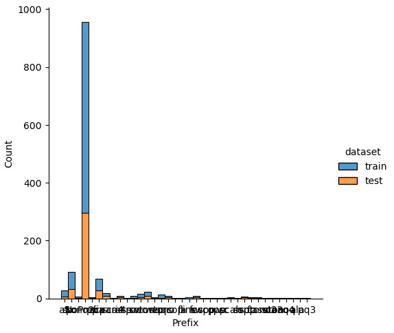
New Features from Ticket
The feature “Ticket” is very complex and might be unique. But there are some new features that we can extract from the ticket feature:
- Prefix: non numerical prefix of a ticket
- TNlen: length of numeric ticket number
- LeadingDigit: first digit of numeric ticket number
- TGroup: numeric ticket number without the last digit
df_train[['Ticket']].head()


"""
Ticket
0	A/5 21171
1	PC 17599
2	STON/O2. 3101282
3	113803
4	373450
"""
If we take a look at the “Ticket” feature, we can see that there is a schema in that ticket feature. The ticket contains consists of a first non numeric part with or without special character and a second numeric part or only the numeric part. With this schema in mind, we can create a function to extract different features out of the ticket.
def get_prefix(ticket):
    """
    check if the first part of the ticket (separated by a space) are letters
    return only the letter or the information that the first part does not contain only letter
    """
    lead = ticket.split(' ')[0][0]
    if lead.isalpha():
        return ticket.split(' ')[0]
    else:
        return 'NoPrefix'

def ticket_features(df):
    """
    Prefix: non numerical prefix of a ticket
    TNlen: length of numeric ticket number
    LeadingDigit: first digit of numeric ticket number
    TGroup: numeric ticket number without the last digit
    """
    df['Ticket'] = df['Ticket'].replace('LINE','LINE 0')
    df['Ticket'] = df['Ticket'].apply(lambda x: x.replace('.','').replace('/','').lower())
    df['Prefix'] = df['Ticket'].apply(lambda x: get_prefix(x))
    df['TNumeric'] = df['Ticket'].apply(lambda x: int(x.split(' ')[-1]))
    df['TNlen'] = df['TNumeric'].apply(lambda x : len(str(x)))
    df['LeadingDigit'] = df['TNumeric'].apply(lambda x : int(str(x)[0]))
    df['TGroup'] = df['TNumeric'].apply(lambda x: str(x//10))

    df = df.drop(columns=['Ticket','TNumeric'])

    return df

df_train = ticket_features(df_train)
df_test = ticket_features(df_test)
First we create a helper function get_prefix that checks if the first part of the ticket is a combination of letters or not. Only if the first part of ticket starts with letters, the function returns the first part of ticket or returns the string “NoPrefix”.
The actual function ticket_features starts by correcting a misspelling (LINE) and replace “.” and “/” with nothing. Also we cast all letters to lowercase. Now we apply our function get_prefix to the ticket feature to get the “Prefix” feature.
To get the rest of the features, we extract the numeric part of the ticket, by splitting the ticket by a whitespace and only keeping the last part of the substring. Because we want that the numeric part of the ticket is a number, we convert the string to an integer.
To get the length of the numeric part of the ticket, we recast the column “TNumeric” as string, because we can only compute the length of a string and not of an integer.
The feature “LeadingDigit” is extracted as first part of the numeric part of the ticket and converted as integer.
The numeric ticket number without the last digit is extracted from the integer by applying the floor division of 10 to the integer. Another possibility is to convert the integer to a string and keeping the whole string but not the last element my_str = my_str[:-1]
After we get all our four new features together, we compute the influence to the survival rate.
Influence of LeadingDigit to the survival rate
# show the survival rate for each LeadingDigit
_ = pivot_survival_rate(df_train, "LeadingDigit")| LeadingDigit | not_survived | survived | passengers | survival_rate |
| 0 | 3 | 1 | 4 | 25 |
| 1 | 91 | 140 | 231 | 60.6061 |
| 2 | 136 | 94 | 230 | 40.8696 |
| 3 | 272 | 95 | 367 | 25.8856 |
| 4 | 13 | 2 | 15 | 13.3333 |
| 5 | 7 | 2 | 9 | 22.2222 |
| 6 | 13 | 1 | 14 | 7.14286 |
| 7 | 11 | 4 | 15 | 26.6667 |
| 8 | 3 | 0 | 3 | 0 |
| 9 | 0 | 3 | 3 | 100 |
For the “LeadingDigit” we see that for the main classes of the leading digit 1, 2 and 3, the lower the leading digit is, the higher is the survival rate.
Influence of TNlen to the survival rate
# show the survival rate for each TNlen
_ = pivot_survival_rate(df_train, "TNlen")| TNlen | not_survived | survived | passengers | survival_rate |
| 1 | 5 | 1 | 6 | 16.6667 |
| 3 | 4 | 3 | 7 | 42.8571 |
| 4 | 113 | 52 | 165 | 31.5152 |
| 5 | 107 | 139 | 246 | 56.5041 |
| 6 | 288 | 135 | 423 | 31.9149 |
| 7 | 32 | 12 | 44 | 27.2727 |
Also, for the ticket length “TNlen” there are clear differences in the survival rate. Passengers with a numeric ticket length of 5 have the highest survival rate of 65.5%. In comparison, the two other “TNlen” classes with more than 100 passengers (4 and 6) have only a survival rate of around 32%.
Influence of Prefix to the survival rate
# show the survival rate for each Prefix
_ = pivot_survival_rate(df_train, "Prefix")| Prefix | not_survived | survived | passengers | survival_rate |
| NoPrefix | 407 | 254 | 661 | 38.4266 |
| a4 | 7 | 0 | 7 | 0 |
| a5 | 19 | 2 | 21 | 9.52381 |
| as | 1 | 0 | 1 | 0 |
| c | 3 | 2 | 5 | 40 |
| ca | 27 | 14 | 41 | 34.1463 |
| casoton | 1 | 0 | 1 | 0 |
| fa | 1 | 0 | 1 | 0 |
| fc | 1 | 0 | 1 | 0 |
| fcc | 1 | 4 | 5 | 80 |
| line | 3 | 1 | 4 | 25 |
| pc | 21 | 39 | 60 | 65 |
| pp | 1 | 2 | 3 | 66.6667 |
| ppp | 1 | 1 | 2 | 50 |
| sc | 0 | 1 | 1 | 100 |
| sca4 | 1 | 0 | 1 | 0 |
| scah | 1 | 2 | 3 | 66.6667 |
| scow | 1 | 0 | 1 | 0 |
| scparis | 6 | 5 | 11 | 45.4545 |
| soc | 5 | 1 | 6 | 16.6667 |
| sop | 1 | 0 | 1 | 0 |
| sopp | 3 | 0 | 3 | 0 |
| sotono2 | 2 | 0 | 2 | 0 |
| sotonoq | 13 | 2 | 15 | 13.3333 |
| sp | 1 | 0 | 1 | 0 |
| stono | 7 | 5 | 12 | 41.6667 |
| stono2 | 3 | 3 | 6 | 50 |
| swpp | 0 | 2 | 2 | 100 |
| wc | 9 | 1 | 10 | 10 |
| wep | 2 | 1 | 3 | 33.3333 |
From the survival rate of the “Prefix”, we see that there are 661 passengers that have no prefix in their tickets. Compared to the mean survival rate of 38%, that we saw in the data analysis notebook, there are some prefixes, with more than 10 passengers, that have either a higher or lower survival rate:
- “Pc” has 60 passengers and a mean survival rate of 65%
- “Sotonoq” has 15 passengers and only a mean survival rate of 13%
- “Wc” has 10 passengers and only a mean survival rate of 10%
- “A5” has 21 passengers and only a mean survival rate of 9.5%
With the “Prefix” feature it could be possible to differentiate if a passenger survived the titanic or not. I am interested if this feature has a high importance during the evaluation of the classifier.
Influence of TGroup to the survival rate
# there are too many unique values for TGroup
df_train.TGroup.nunique()
Our last feature is the numeric part of the ticket without the last digit “Tgroup” that has in total 338 unique values and therefore too many to visualize as table with our pivot_survival_rate function.
# group the training data by TGroup to get the number of passengers per TGroup
df_tgroup = df_train[['TGroup', 'PassengerId']].groupby(['TGroup']).nunique().sort_values(by='PassengerId', ascending=False)
# filter TGroup that contains more or equal 10 passengers
df_tgroup = df_tgroup[df_tgroup.PassengerId >= 10]

# filter the whole training data to the samples that are in the selection of TGroup
df_tgroup = df_train[df_train['TGroup'].isin(df_tgroup.index)]

# create a catplot for the survival rate of each filtered TGroup
sns.catplot(x='TGroup', y="Survived", data=df_tgroup, kind="bar")
plt.show()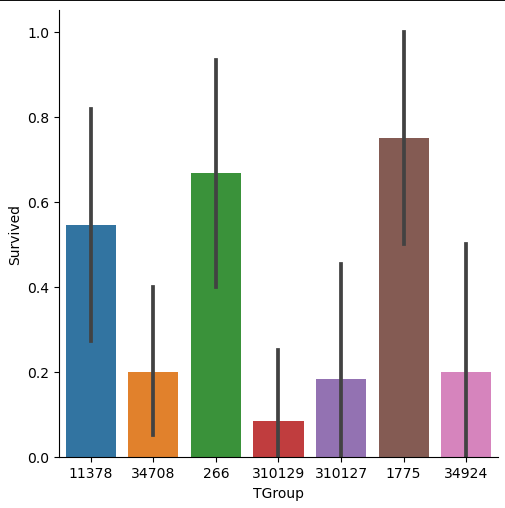
Therefore, we filter the training data to the samples of TGroup, that contains more or equal 10 passengers and calculate the survival rate for this selection of TGroup. The implementation is done by grouping the training data by “TGroup” and calculate the number of unique values of the passenger ID. Then we filter our table to entries with more or equal 10 passengers. Now we only must filter the training data by “TGroup” values that are in our filtered grouped table as index.
To visualize the data, we create a categorical plot where we have the “TGroup” on the x-axis and the survival rate on the y-axis. From the catplot you see that there are in total seven “TGroup” classes with more or equal 10 passengers. The survival rate differs much between the categories of “TGroup” and all classes have a high width of the confidence interval.
In my opinion, the feature “Tgroup” will not have a positive impact on the classifier because there are too many unique classes and the classes that contain more passengers have a wide confidence interval.
Fix or Remove Outliers
In our next section of the data cleaning and preparation, we want to fix or remove outliers in the dataset. Outlier can have a negative effect on the statistical analysis by increasing the variability in the data. But how can we identify outliers? There are many methods to identify outliers but one of my recommendations, when the dataset is not too large, is to use simple box plots.
Box plots are a graphical depiction of numerical data through their quantiles and therefore a very simple but effective way to visualize outliers. Numeric features that have only few unique values like, “Parch”, “Pclass” and “SibSp” can have outliers. The risk is too high to delete one unique value that has only a few entries, because if the test set contains this value, the algorithm has no chance to consider this value during the training. Therefore, we only create a boxplot for “Age” and “Fare”.
I am also interested if outliers are present between the training and test dataset. Therefore, we combine the training and test dataset and create a boxplot for “Age” and “Fare”, each boxplot separated by the training and test dataset.
# define a list with numeric features of which we want to look at the boxplot
num_features = ["Age", "Fare"]

# combine the training and test dataset
df_merge = pd.concat([df_train, df_test])

# create a boxplot of each selected feature seperated by the training and test dataset
for feature in num_features:
    plt.figure() # create a new figure for each plot
    sns.boxplot(data=df_merge, y=feature, x="dataset")
    plt.show()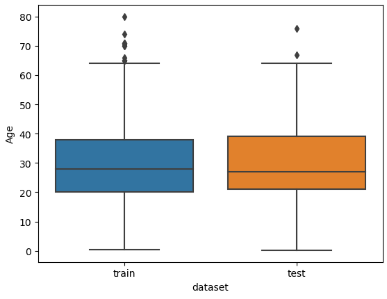
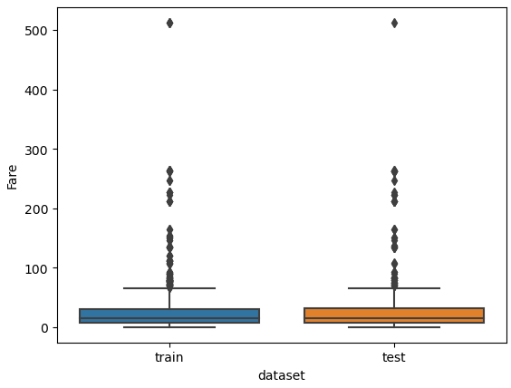
From the two boxplots we see that the age of some passengers could be seen as outliers but are close enough to the upper whiskers to keep all values in “Age”. For the feature “Fare” all values higher than 300 could be classified as outliers but a fare higher than 300 can be found in the training and test dataset. For this reason, we do not remove data points from “Fare”.
Moreover, later we will create two new features by discretize the “Age” and “Fare” features. That will also remove potential outliers by compressing the data points to a different scale.
Fix or Remove Missing Values
From the data analysis part, we saw in the statistical reports, that there are some missing values in the training and test dataset. Most machine learning algorithms can not handle missing values. Therefore, either we remove the whole column or fill the missing values. Additionally for the training set we can delete samples but because we must submit all samples of the test set, there is no possibility to delete samples of the test dataset.
To get an overview of all missing values, I created the following function find_missing_values that returns for each feature that contains missing values, the total number of missing values and the percentage of missing values.
def find_missing_values(df):
    """
    find missing values in the dataframe
    return the features with missing values, the total number of missing values and the percentage of missing values
    """
    total = df.isnull().sum().sort_values(ascending=False) # compute the total number of missing values
    percent = (df.isnull().sum()/df.isnull().count()).sort_values(ascending=False) # compute the percentage of missing values
    missing_data = pd.concat([total, percent], axis=1, keys=['Total', 'Percent']) # add all information to one dataframe
    missing_data = missing_data[missing_data['Total']>0] # filter the dataframe to only the features with missing values
    return missing_data
find_missing_values(df_train)
"""
Total Percent
Cabin 687 0.771044
Age 177 0.198653
Embarked 2 0.002245
"""find_missing_values(df_test)
"""
Total Percent
Cabin 327 0.782297
Age 86 0.205742
Fare 1 0.002392
"""When we apply the function to the training and test dataset, we see that there are in total 687 missing values of cabin in the training data and 327 missing values in the test dataset that is around 77% and 78% of all samples. Because there is such a large number of missing values for “Cabin”, we will delete this feature from the training and test data.
For “Embarked” there are only 2 missing values in the training data that we will input via a comparison to other passengers with same parameters in other features. Also, the single missing value of “Fare” in the test dataset will be solved by comparison.
For the feature “Age” there are around 20% of all values missing. Because it is hard to compare different features to guess an age, we will try to input the missing values of “Age” by a machine learning algorithm.
Missing Values of “Cabin”
Our first task is quickly done by deleting the feature “Cabin” from the training and test dataset. Make sure to set the axis to 1 to drop the column and not every single row.
df_train = df_train.drop(['Cabin'], axis=1)
df_test = df_test.drop(['Cabin'], axis=1)
Missing Values of “Embarked”
Next, we take a closer look to the two samples of the training data, where the port of embarkation is missing.
df_train[df_train['Embarked'].isnull()]
From the table we see that both passengers have the “Pclass” 1 and a “Fare” of 80. We want to find out what is the port of embarkation with the highest likelihood for passengers with a “Pclass” of 1 and a “Fare” of 80. Therefore, we create a boxplot with “Embarked” as x-axis, “Fare” as y-axis and separated by the “Pclass”. If we limit the Fare to lower than 200, we have a little error in the boxplot, but we improve the readability.
# limit the "Fare" to values lower than 200 to make the chart more readable
sns.boxplot(x="Embarked", y="Fare", hue="Pclass", data=df_train[df_train['Fare']<200])
plt.show()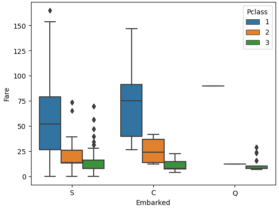
From the boxplot we see that passengers that embarked from Cherbourg had a median fare of around 80 for the first passenger class. Also, we already know that passengers of Cherbourg (C) have the highest survival rate with 55% and both passengers where we have missing data survived. For this reason, we will fill the two missing values of “Embarked” with Cherbourg.
df_train["Embarked"] = df_train["Embarked"].fillna("C")Missing Values of “Fare”
There is one missing values of “Fare” in the test dataset. We will use the same process as we did with the missing values of “Embarked”. Fist we take a closer look at the passenger with the missing value of “Fare”.
df_test[df_test['Fare'].isnull()]
We see that the passenger was in the passenger class 3 and embarked in Southampton. In my opinion is the passenger class and the port of embarkation the main drivers for the ticket fare. Therefore, we fill the missing value of “Fare” with the median fare for all passengers that embarked in Southampton with the passenger class 3. First, we filter the training data to our relevant parameters and calculate the median. The empty ticket fare is than filled with this median value.
median_fare = df_test[(df_test['Pclass'] == 3) & (df_test['Embarked'] == 'S')]['Fare'].median()
df_test["Fare"] = df_test["Fare"].fillna(median_fare)
Missing Values of “Age”
For the feature “Age” there are around 20% of missing values in the training and test dataset. The missing values of age are very hard to estimate or calculate by a mean or median. Therefore, we use a Random Forest Regressor to fill the missing values. The following points show the process:
- First, we combine the training and test set to be able to fill the missing values in both datasets. Afterwards we input the missing values, we split the datasets again into the training and test set.
- The second step is to split the combined dataset into a dataset where we know the age of the passengers (age_train) and in one dataset, where the “Age” column contains the missing values (age_test).
- Then we train the Random Forest Regressor with the training set and predict the “Age” of the test set.
- In the last step we replace the missing values of age with the predicted output of the test set.
Before we take a look at the function to fill the missing values of “Age” we have to import some additional libraries from sklearn. The regression algorithm itself and some functions for the preprocessing of the data and to build a clean data pipeline.
Now let’s dive into the function fill_missing_age. In the first step I filter the dataset to columns that I want to use for the regression. Then I split the dataset to the training and test dataset and create the label array age_train_y and the feature array age_train_x for the training set.
Building the sklearn pipeline contain the following steps for this regression model:
- We create an object of the Random Forest Regressor and define the number of estimators to 2000. I set the number of jobs to -1 to use all my CPU cores for the training for the model.
- At this point we have quite some categorical features that are not numeric. But because the machine learning model can only use numeric values, we must transform the features. Therefore, we use the One Hot Encoder for the categorical features and for the only numerical feature “Fare” we apply the Standard Scaler that generally improves the machine learning model.
You could also apply the Min Max Scaler or any other scaler that you want but at this point I try not to overengineer the model, because we only want to input some missing values. - Before the model starts learning, we must define our steps in the pipeline.
- First, we start by transform the features
- Because the one hot encoding creates a lot of features, we use the truncated singular value decomposition to reduce the number of features to 20.
- And in the final step we apply our Random Forest Regressor to the prepared data.
- After the training, we print the R2 score of the training set as metric and like you see, we achieved an R2 score of 0.84 what is very good. When we reduce the number of features for the model from 20 to 10, we get R2 score of 0.82.
- To visualize a regression model, it is always good to predict the label of the test set and create a scatter plot with the predicted values and the actual values like you see in the following plot. I also like to create a line that represents the best possible result in case all points are on this line. The difference of each point to this line is the error of the model.
- We apply the trained model on our test set, where we do not know the age of the passenger and can now fill in the missing values of “Age” with the predicted values.
- After we applied the whole function, we split the combined dataset into the training and test set by knowing the length of the training set.
from sklearn.ensemble import RandomForestRegressor
from sklearn.preprocessing import OneHotEncoder, StandardScaler
from sklearn.compose import ColumnTransformer
from sklearn.pipeline import Pipeline
from sklearn.decomposition import TruncatedSVD

# predicting missing values in age using Random Forest
def fill_missing_age(df):
    # Feature set
    age_df = df[[
        'Pclass', 'Sex', 'Age', 'SibSp', 'Parch', 'Fare', 'Embarked', 'Family', 'Family_Grouped', 'Title',
        'Prefix', 'TGroup', 'Name']]
    # Split sets into train and test
    age_train = age_df.loc[(age_df.Age.notnull())]  # known Age values
    age_test = age_df.loc[(age_df.Age.isnull())]  # null Ages

    # All age values are stored in a target array
    age_train_y = age_train[['Age']]

    # All the other values are stored in the feature array
    age_train_x = age_train.drop('Age', axis=1)

    # Create a RandomForestRegressor object
    rtr = RandomForestRegressor(n_estimators=2000, n_jobs=-1)

    categorical_features = ['Pclass', 'Sex', 'SibSp', 'Parch', 'Embarked', 'Family', 'Family_Grouped', 'Title',
        'Prefix', 'TGroup', 'Name']
    numeric_features = ['Fare']

    col_transform = ColumnTransformer(
            transformers=[
                ('cat', OneHotEncoder(handle_unknown='ignore'), categorical_features),
                ('num', StandardScaler(), numeric_features)
            ]
        )

    # define pipeline
    pipeline = Pipeline(steps=[
        ('columnprep', col_transform),
        ('reducedim', TruncatedSVD(n_components=20)),
        ('regression', rtr)
    ])


    pipeline.fit(age_train_x, age_train_y.values.ravel())

    # Print the R2 score for the training set
    print("R2 score for training set: " + str(pipeline.score(age_train_x, age_train_y)))
    age_train_y_pred = pipeline.predict(age_train_x)

    # plot the actual and predicted values of the training set
    plt.scatter(age_train_y, age_train_y_pred)
    plt.plot([min(age_train_y_pred),max(age_train_y_pred)], [min(age_train_y_pred),max(age_train_y_pred)], c="red")
    plt.xlabel('Age training set')
    plt.ylabel('Age training set predicted')
    plt.show()

    # Use the fitted model to predict the missing values
    predictedAges = pipeline.predict(age_test.drop('Age', axis=1))

    # Assign those predictions to the full data set
    df.loc[(df.Age.isnull()), 'Age'] = predictedAges

    return df


train_objs_num = len(df_train)

features_all = pd.concat([df_train, df_test], axis=0)
features_all = fill_missing_age(features_all)

df_train = features_all[:train_objs_num]
df_test = features_all[train_objs_num:]

"""
R2 score for training set: 0.839941224977828
"""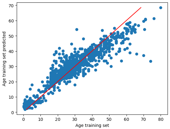
The R2 score of the training data is 0.84 which is very good. The picture shows for the age trainings set the actual values and the predicted values. With a perfect solution of R2=1, all points would be on the red line.
Now comes an important step that I missed during the initial creation of this notebook. In the first notebook for the data analysis, we created a function that creates an age class, called age_category. Because we had missing values, the last class returned a “no age” string. After the imputation of the missing values, we must rerun the function, because otherwise the “Age_category” feature and the “Age” feature does not match.
We only copy the function from the data analysis notebook and apply the age_category function to the training and test dataset. Now we can compute the survival rate of the age category and you see that there is no entry for missing values of age.
def age_category(row):
    """
    Function to transform the actual age in to an age category
    Thresholds are deduced from the distribution plot of age
    """
    if row < 12:
        return 'children'
    if (row >= 12) & (row < 60):
        return 'adult'
    if row >= 60:
        return 'senior'
    else:
        return 'no age'

# apply the function age_category to each row of the dataset
df_train['Age_category'] = df_train['Age'].apply(lambda row: age_category(row))
df_test['Age_category'] = df_test['Age'].apply(lambda row: age_category(row))

# show the suvival table with the previously created function
_ = pivot_survival_rate(df_train, "Age_category")| Age_category | not_survived | survived | passengers | survival_rate |
| adult | 495 | 293 | 788 | 37.1827 |
| children | 35 | 42 | 77 | 54.5455 |
| senior | 19 | 7 | 26 | 26.9231 |
From the table we see that there are some changes in the survival rate after we input the missing values of age:
- survival rate of adult: decrease from 39% to 37%
- survival rate of children: decrease from 57% to 55%
- and survival rate of senior: increase from 27% to 32%
Feature Engineering (2/2)
At this point of the data cleaning and preparation we do not have any missing values in the dataset. Therefore, we can start in the second part of the feature engineering, because I have two features left that are currently not in the dataset.
I already talked about these two features in the first part of the data cleaning and preparation notebook, where we analyzed if there are outliers in the dataset.
To remove the influence of potential outliers you can discretize numeric features into different classes. You do not only reduce the influence of potential outliers, but you also have the chance to expose groups in that feature with a higher survival rate.
To discretize a feature, you use the pandas function qcut, define the column of the pandas dataframe and the number of quantiles. I set the labels to False to get a continuous numbering of the classes. Otherwise, the names of the classes would be the start and end number of the class, like you see in the first plot.
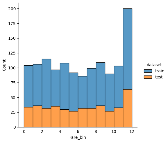
New features: Discretize Fare
After trying different numbers of quantiles, I choose 13 classes for “Fare” and plot the classes as categorical seaborn plot after grouping the data to the new features. The plot is separated by the “Survived” feature and the green line is the mean survival rate that we got from the statistical report in the data analysis notebook.
df_train['Fare_bin'] = pd.qcut(df_train['Fare'], 13)

fig, axs = plt.subplots(figsize=(20, 8))
sns.countplot(x='Fare_bin', hue='Survived', data=df_train)
plt.show()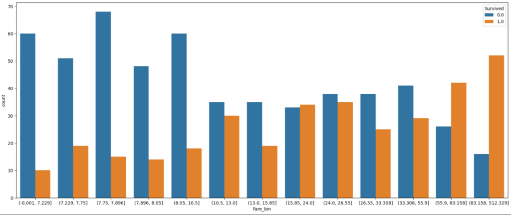
df_train['Fare_bin'] = pd.qcut(df_train['Fare'], 13, labels=False)
df_test['Fare_bin'] = pd.qcut(df_test['Fare'], 13, labels=False)

(df_train
.groupby("Fare_bin")["Survived"]
.value_counts(normalize=True)
.mul(100)
.rename('percent')
.reset_index()
.pipe((sns.catplot,'data'), x="Fare_bin", y='percent',hue="Survived",kind='bar'))
plt.axhline(y=38, color='g', linestyle='-')
plt.show()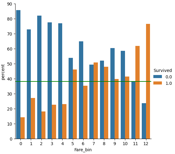
From the plot we see that the survival rate increases with increasing “Fare”. But if you look at classes 6, 9 and 10 for the “Fare_bin” feature, you see that the survival rate drops.
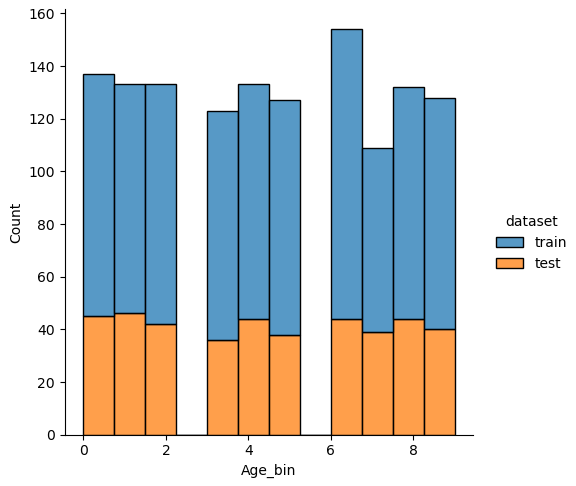
New features: Discretize Age
For the feature “Age” I did exactly the same but choose 10 classes. From the categorical plot you see that only for the first class of “Age_bin” the chance to survive was greater than 50%.
df_train['Age_bin'] = pd.qcut(df_train['Age'], 10, labels=False)
df_test['Age_bin'] = pd.qcut(df_test['Age'], 10, labels=False)

(df_train
.groupby("Age_bin")["Survived"]
.value_counts(normalize=True)
.mul(100)
.rename('percent')
.reset_index()
.pipe((sns.catplot,'data'), x="Age_bin", y='percent',hue="Survived",kind='bar'))
plt.axhline(y=38, color='g', linestyle='-')
plt.show()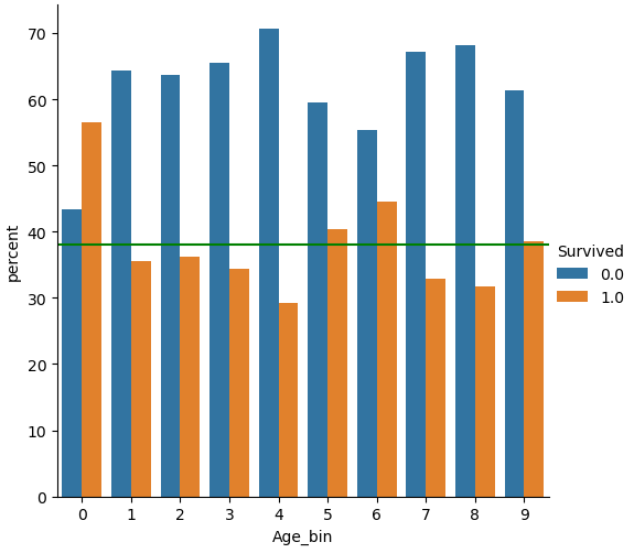
Feature Scaling
The next part of the data cleaning is to analyze if there is any noise in the features. There are multiple kinds of noise, but we will focus on the following two kinds:
- Is there a noise between the training and test dataset that would prevent the machine learning algorithm from learning because there are missing values for a feature either in the training or test dataset?
- Is there any noise in one or more feature based on its distribution? If there is any noise for example through outliers or rounding errors, we maybe must process the data to create a more normal distribution.
Is there Noise between the Training and Test Dataset?
The easiest and fastest way to analyze the noise between the training and test dataset is to plot the distribution of each numeric feature separated by the training and test dataset.
Therefore, we combine the training and test dataset and loop through every column. In every loop we check if the number of unique values is lower than 100, because otherwise a distribution plot has too many bars and in each class there are too few passengers With too few passengers the results are not robust enough.
# combine the training and test dataset
df_merge = pd.concat([df_train, df_test])

# plot the distribution plot of each selected feature seperated by the training and test dataset
for feature in df_merge.columns:
    # plot only the distribution if there are less than 100 unique values for the feature
    # for example name has a lot of unique values that will be one-hot-encoded for the classifier
    if df_merge[feature].nunique() < 100:
        sns.displot(df_merge, x=feature, hue="dataset", multiple="stack")
        plt.show()
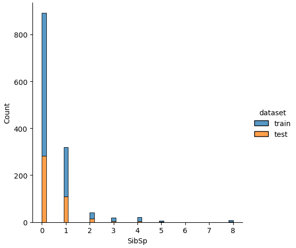
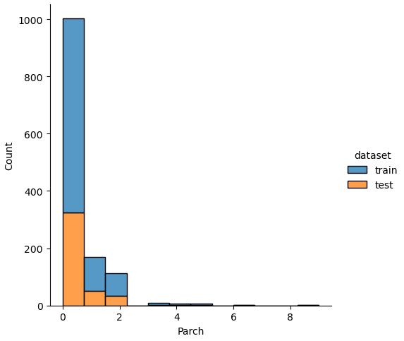
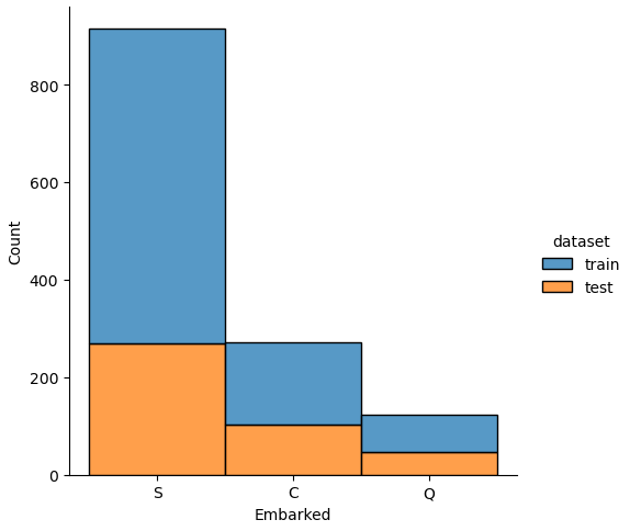
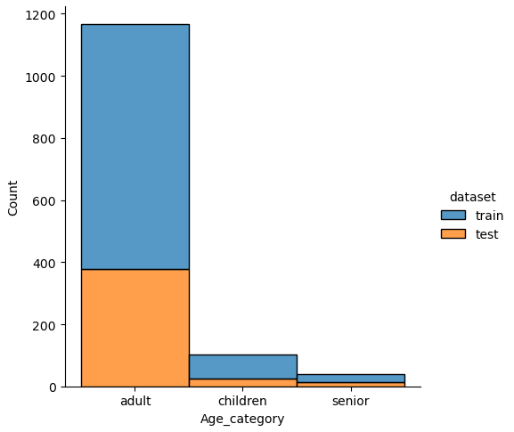
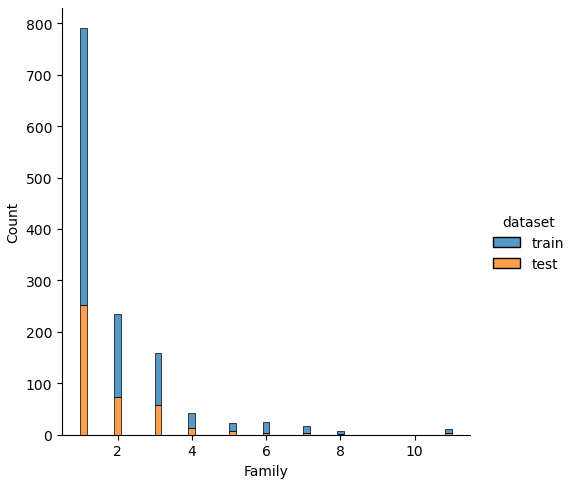
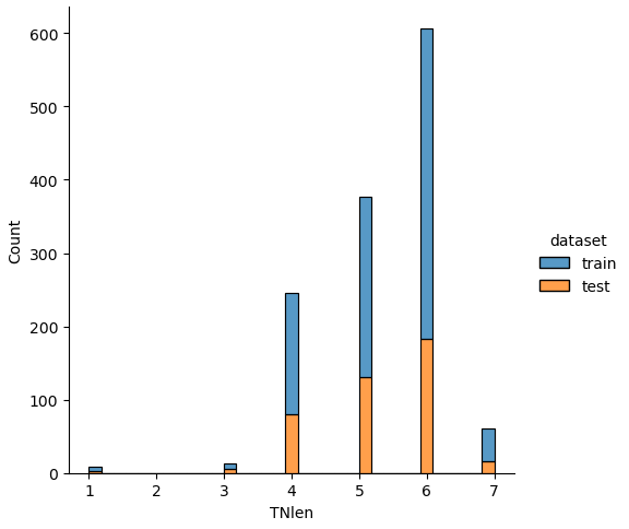
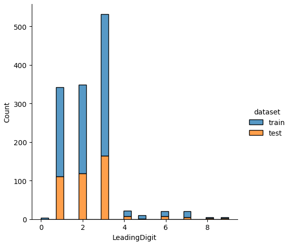
If we analyze the distribution plots, we can skip the features “Survived” and “dataset” because we know that “Survived” is only in the training data and “dataset” is only a feature for the visualization.
The result of the histograms is that the features are well distributed between the training and test dataset. There is no class that is present in only the training or test dataset.
Is there any Noise in one or more Feature based on its Distribution?
To analyze the dataset for general noise based on its distribution, we use the scipy stats library to compute the skewness of every feature:
- A skewness of 0 indicates a normally distributed feature
- If the skewness is greater 0 that means that more weight is in the left tail of the distribution. To make the distribution more normal, it is possible to apply the square, cube root or logarithmic function to the feature.
- If the skewness is negative and therefore lower than 0, there is more weight in the right tail of the distribution. Possible transformations are the square root, cube root, and log function to make the distribution more normal distributed.
We compute the skewness of the combined training and test data with the following function and only return features that have a strong skewness higher 1 or lower -1.
In the function compute_skewed_features we find all numeric features by searching for every datatype but an object. In a new created pandas dataframe the skewness is computed for every numeric feature by the scipy stats skew function. We also compute the number of unique values for each numeric feature because numeric features that have only a few unique values are not relevant for the noise consideration.
from scipy.stats import skew
def compute_skewed_features(df):
    """
    compute the skewness of all numeric features and the total number of unique values
    return only the features that have a relevant skewness
    """
    numeric_feats = df.dtypes[df.dtypes != "object"].index
    skewed_feats = pd.DataFrame(index=numeric_feats, columns=['skewness', 'unique_values'])
    skewed_feats['skewness'] = df[numeric_feats].apply(lambda x: skew(x))
    skewed_feats['unique_values'] = df.nunique()
    skewed_feats = skewed_feats[(skewed_feats['skewness'] > 1) | (skewed_feats['skewness'] < -1)]

    return skewed_feats

# combine the training and test dataset
df_merge = pd.concat([df_train, df_test])
skewed_feats = compute_skewed_features(df_merge)

skewed_feats

"""
	                skewness	      unique_values
SibSp	        3.839814	      7
Parch	        3.664872	      8
Fare	                4.364205	      281
Family	        2.849808	      9
LeadingDigit	1.725896	      10
"""
From the table, we see that there are 4 features (“SibSp”, “Parch”, “Family” and “LeadingDigit”) that are positive skewed but have only a few unique values because they are classes with numeric values. Therefore, we will not transform these 4 features.
The feature “Fare” is positive skewed and has more than 10 unique values. We will apply the logarithmic transformation to “Fare” and plot the distribution chart before and after the transformation to see the difference.
for feature in ['Fare']:

    # view the distribution of Fare after the log transformation with the skewness
    df_merge = pd.concat([df_train, df_test])
    g = sns.displot(df_merge[feature])
    plt.title("Skewness : %.2f"%(df_merge[feature].skew()))
    plt.show()

    df_train[feature] = df_train[feature].apply(np.log)
    df_test[feature] = df_test[feature].apply(np.log)

    # the not transformed data that contains 0
    # after the transformation we have -inf values that have to be replaced by 0
    df_train[feature][np.isneginf(df_train[feature])]=0
    df_test[feature][np.isneginf(df_test[feature])]=0

    # view the distribution of Fare after the log transformation with the skewness
    df_merge = pd.concat([df_train, df_test])
    g = sns.displot(df_merge[feature])
    plt.title("Skewness : %.2f"%(df_merge[feature].skew()))
    plt.show()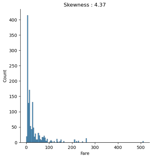
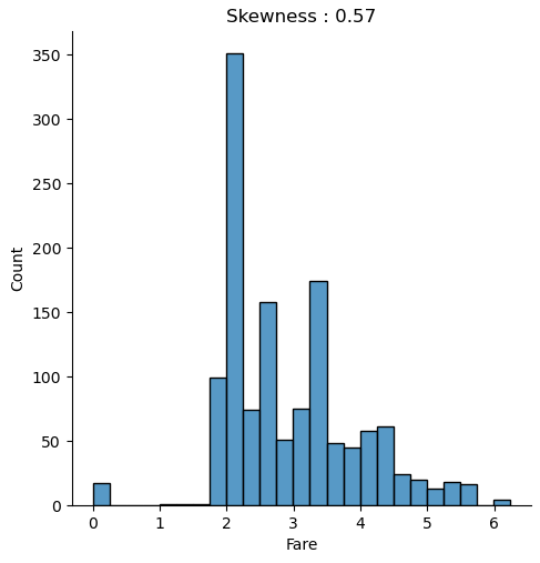
The distribution chart is created for the combined training and test dataset because we must compute every transformation to both datasets. We use the numpy log function to transform the fare to a logarithmic scale. When you apply a transformation, make sure that you do not get infinite value. Exactly that is the case for “Fare”, because all samples that have a “Fare” of zero will have a value of minus infinite after the transformation. Therefore, we replace the infinite values with zero for the training and test dataset.
When we compare both distributions, we see that after the logarithmic transformation, the skewness is reduced from 4.37 to 0.57 and the distribution is closer to a normal distribution.
Feature Selection (1/2)
Our next big step in the data preparation is to transform categoric features to numeric features. To reduce the number of features that we transform, we can already delete some features at this point of the notebook.
The Passenger ID is only a consecutive numbering and contains no real information. Also the feature “dataset” that we created for plotting can be deleted. Because we already extracted new features from “Name” we can delete the “Name” feature as well as the first name, because the first name has no influence on the survival rate.
For the test dataset, we must delete the feature “Survived” that was created when we split the dataset after filling the missing values of “Age”.
df_train.drop(['PassengerId', 'Name', 'dataset', 'First'], axis=1, inplace=True)
df_test.drop(['PassengerId', 'Name',  'dataset', 'Survived', 'First'], axis=1, inplace=True)
Transform Categoric Features to Numeric
As I already mentioned, all machine learning algorithm desire number as input. Therefore, we transform all categorical features to numeric features.
There are multiple sklearn function to transform features. But we must differ between the transformation of the label and the features. In our case the label “Survived” is already numeric, so that we only apply the One Hot Encoder to the categoric features.
First, we have to import the OneHotEncoder function from sklearn and create an OneHotEncoder object. This object has the attribute handle_unknown that we set to ignore to not return any errors if a value only applies in the test dataset. This value is not transformed when the dataset is fitted to the training data. Because I want to keep a pandas dataframe in the end, I set the spare attribute to false to not get a sparse matrix but an array.
To transform only the categories, we filter the training data to the index of the datatype object. Then we fit and transform the features of the training data to the OneHotEncoder that returns an array without the column names. Because I am also interested to get the columns name to compute the feature importance in a later stage of this project, we create a new dataframe with the transformed matrix and the column names that we also get from the OneHotEncoder via the get_features_name function.
To see if the encoding was successful, we plot the shape of the training data and the shape of the new created dataset. The only thing that is currently missing are our numeric features from the training data. Therefore, we join the encoded categorical features to the training data and delete the categories that are now numeric.
from sklearn.preprocessing import OneHotEncoder
enc = OneHotEncoder(handle_unknown='ignore', sparse=False)
cat_vars = df_train.dtypes[df_train.dtypes == "object"].index

ohe_train = pd.DataFrame(enc.fit_transform(df_train[cat_vars]), columns=enc.get_feature_names())
print("df_train old shape: " + str(df_train.shape))
print("ohe_train old shape: " + str(ohe_train.shape))
df_train = pd.concat([df_train, ohe_train], axis=1).drop(cat_vars, axis=1)
print("df_train new shape: " + str(df_train.shape))

ohe_test = pd.DataFrame(enc.transform(df_test[cat_vars]), columns=enc.get_feature_names())
print("df_test old shape: " + str(df_test.shape))
print("ohe_test old shape: " + str(ohe_test.shape))
df_test = pd.concat([df_test, ohe_test], axis=1).drop(cat_vars, axis=1)
print("df_test new shape: " + str(df_test.shape))
From the shape of the new created training data, you see that before the transformation we had 18 features and after the OneHotEncoding, we have 1062 features. For the test dataset, we do exactly the same, but instead of fitting the test dataset to the OneHotEncoder, we use the already fitted encoder and only transform the test data.
Do not fit any test data to a function.
Use the fit_transform function for the training data and only the transform function for the test data.
With such a high number of features, you machine learning model will quickly overfit the training data. At this point we have two different possibilities that we will do both.
- First, we save the prepared training and test dataset and in a later stage of the project we will use an algorithm to reduce the number of features in our sklearn pipeline.
- The second option is to reduce the number of features by the following methods
- Drop features that have a low variance
- Drop one of two features with a high correlation
# save prepared dataset as pickle file
df_train.to_pickle('df_train_prepared.pkl')
df_test.to_pickle('df_test_prepared.pkl')
Feature Selection (2/2)
In the first part of the feature selection, we dropped features that don’t provide any information about the survival rate. In the second part we will use mathematical criteria to select features for the classifier.
Drop Features with Low Variance
Features with a low variance contain only few information about the feature. With nearly no information the classifier can not learn from this feature. Think about a feature that only contains the number 3 and therefore has a variance of 0. This feature does not help to decide if a passenger survived the Titanic or not.
We use the sklearn VarianceThreshold function for this task and set the threshold to 95%*1-95%. That will remove all features that are either one or zero in more than 95% of the samples.
We want to apply all features to the variance threshold function but not the “Survived” label. Therefore, we remove the label from the list and fit the VarianceThreshold object to the training data. We get our reduced list of feature names from the get_support function when we set the indices to true.
By transforming the training data, that we fitted before and transforming the test dataset, we get our reduced training and test dataset back with reduced features. But don’t forget to join the label “Survived” again to the training data, because before, we deleted “Survived” from the list that was fit to the VarianceThreshold object.
df_train.head()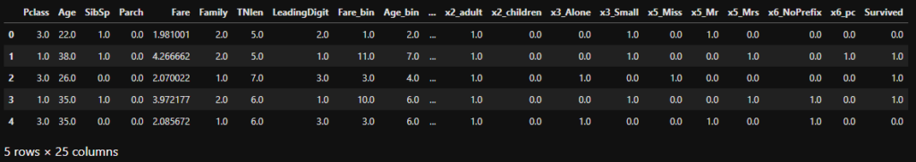
When we look at the top of the training table, we see that the match between the column names and data was successful and that we reduced the number of features from 1062 to 24, a great achievement.
If you want more features in the dataset, you could simply reduce the threshold from 95% to for example 90% or 80%.
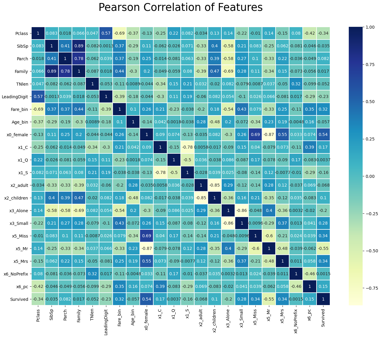
Drop Features with a High Correlation
If two or more features have a high correlation, only one feature adds information to the machine learning algorithm. Multiple features with a high correlation can lead to overfitting, like coping a feature 10 times does not add any useful information to the dataset. Therefore, we calculate the Pearson correlation between each feature and delete features that have a correlation higher than 0.9 or lower -0.9.
In the first step we calculate the Pearson correlation between all features and only select the upper triangle of the correlation matrix to avoid that features are marked twice.
Then we loop through all columns of the upper triangle and create a list with features that have a Pearson correlation higher than 0.9 or lower than -0.9.
To create a nice output in the Jupyter notebook, I loop through each of the selected features to print the feature combination with the Pearson correlation that we want to drop.
corr_matrix = df_train.corr().abs()

# Select upper triangle of correlation matrix
upper = corr_matrix.where(np.triu(np.ones(corr_matrix.shape), k=1).astype(np.bool))

# Find features with correlation higher than 0.9 or lower -0.9
to_drop = [column for column in upper.columns if any((upper[column] > 0.9) | (upper[column] < -0.9))]

for element in to_drop:
    column_list = list(df_train.columns[np.where(
        (df_train.corrwith(df_train[element]) > 0.9) |
        (df_train.corrwith(df_train[element]) < -0.9))])
    column_list.remove(element)
    for column in column_list:
        print(str(element) + " <-> " + str(column) + ": " + str(df_train[element].corr(df_train[column])))


"""
Fare_bin <-> Fare: 0.9332961170608554
Age_bin <-> Age: 0.9546623981546829
x0_male <-> x0_female: -0.9999999999999999
"""
In our case, we found that “Fare_bin” with “Fare”, “Age_bin” with “Age” and “x0_male” with “0x_female” have a high correlation. Which feature you select to drop makes no difference. In my case I choose to drop “Fare” and “Age”, because we created the discretize features with the intention to reduce the influence of possible outliers. Additionally, I drop the feature “x0_male”.
With the seaborn library we can create a nice heatmap that shows the correlation between all features that we will finally use to train our classifier.
df_train.drop(['Fare', 'Age', 'x0_male'], axis=1, inplace=True)
df_test.drop(['Fare',  'Age', 'x0_male'], axis=1, inplace=True)

plt.figure(figsize=(16,12))
plt.title('Pearson Correlation of Features', y=1.05, size=25)
sns.heatmap(df_train.corr(),linewidths=0.1,vmax=1.0, square=False, linecolor='white', annot=True, cmap="YlGnBu")
plt.show()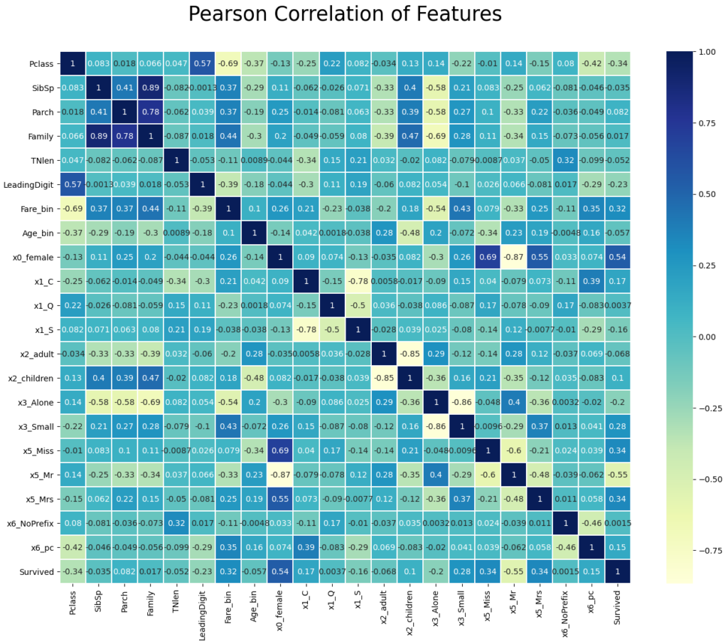
Our final task at the end of the data cleaning and preparation notebook is to save the training and test dataset as pickle files.
# save prepared dataset as pickle file
df_train.to_pickle('df_train_prepared_reduced.pkl')
df_test.to_pickle('df_test_prepared_reduced.pkl')
See you next time and in the meantime, happy coding.