Today we start the Titanic Kaggle competition. Our objective is to build a classifier that predicts which passengers of the Titanic survived.
If you want a detailed description of the Titanic Kaggle competition, you find all information on the Kaggle website.
I separated the process of building the classifier in the following tasks:
- Today we take the first step. We analyze the data to get a good understanding about the features in the given dataset.
- The next part will be the data cleaning and preparation to get the most out of the machine learning algorithms.
- The third step is the creation of our first basic machine learning models, starting from a very simple classifier to a 3 staged sklearn pipeline.
- In the last step, we will build multiple advanced machine learning models including ensembled methods and analyzing the feature importance.
In this article we start with the first step in every machine learning project: the data analysis. Week by week I will publish the next article of the Titanic competition and put the link to all articles at the end of every article.
I do almost all my work in a Jupyter Notebook. All notebooks are stored in a GibHub repository.
Import all Libraries
# pandas: handle the datasets in the pandas dataframe for data processing and analysis
import pandas as pd
print("pandas version: {}". format(pd.__version__))

# matplotlib: standard library to create visualizations
import matplotlib
import matplotlib.pyplot as plt
print("matplotlib version: {}". format(matplotlib.__version__))

# seaborn: advanced visualization library to create more advanced charts
import seaborn as sns
print("seaborn version: {}". format(sns.__version__))

# turn off warnings for better reading in the Jupyter notebbok
pd.options.mode.chained_assignment = None  # default='warn'
The first step in almost every Python script is to import all necessary libraries that we need. One thing that I recommend is to print the installed version of all used libraries. This helps a lot when you debug parts of your code or you copy a section of my code, but it does not compile, because your version of a library is outdated.
In total, I only use the standard libraries that you should already know:
- I use pandas to handle the whole dataset
- For visualizations I use seaborn because in my opinion the charts have a nicer and more modern look. And on top I use matplotlib to change details of the seaborn figures.
To make the code cleaner for this video, I turn off all warnings.
Load Training and Test Dataset
I already downloaded all files of the Titanic Kaggle competition in a folder named 01_rawdata. Therefore, I can read the training and test dataset and create a pandas dataframe for each dataset.
# load training and test dataset
df_train = pd.read_csv('../01_rawdata/train.csv')
df_test = pd.read_csv('../01_rawdata/test.csv')
With the training set, we train the classifier that we will build and with the test dataset, we create a submission file to get an official score from the Kaggle website. This official score shows how good the final machine learning model is.
First Look at the Training and Test Dataset
To get a fist look at the training and test datasets, we plot the first few lines and create basic statistical reports.
Print the first lines of the dataset
The first step in my data analysis process is to get a feeling for the features. Therefore, I print the first 10 lines of the training and test datasets.
# print the first 10 lines of the training data
df_train.head(10)

# print the first 10 lines of the test data
df_test.head(10)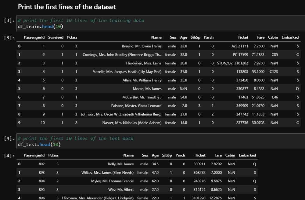
If you take a closer look to both datasets, you notice the following things:
- The PassengerId starts with 1 in the training set and with 892 in the test dataset. Therefore, the PassengerId looks like a consecutive numbering of individual passengers.
- The column Survived is only in the training set and should be predicted from the test dataset.
- All other columns are available in the training data set as well as in the test data.
- The Ticket feature is very cryptic and maybe hard to process.
- And the Cabin column has a lot of NaN values that is short for “Not a Number” and represents empty cells in a pandas dataframe.
Create a Statistical Report of Numeric and Categorical Features
By printing out the first lines of the Titanic data, you get a first view of the data, but not a good understanding of all samples. Therefore, we create statistical reports including all numeric and categoric features for both datasets.
To create such statistical reports, we use the pandas describe function. I use the transpose function to get the report for each feature in a row, because otherwise if you have a lot of features, you get endless columns that are hard to visualize in a Jupyter notebook.
For all numeric features we get the following information in the statistical report:
- the number of non-empty rows
- mean and standard deviation
- the 25th, 50th, and 75th percentiles, where the 50th percentile is equal to the median
- and you get the minimum and maximum value of each feature
# create the statistic report of the numeric features of the training dataset
df_train.describe().transpose()

# create the statistic report of the numeric features of the test dataset
df_test.describe().transpose()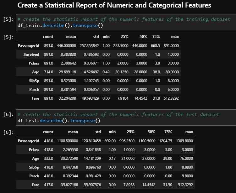
So, what are the results from the statistical report of the numeric features?
- From the number of non-empty rows, we see that the training dataset contains 891 samples and the test dataset 418 samples.
- The PassengerId is consecutively numbered and a false added afterwards information to the datasets.
- The feature Age has missing values (714 instead of 891 in the training dataset and 332 instead of 418 in the test dataset). We will handle the missing values in the next article during the data cleaning and preparation.
- The mean of the Survived column is 0.38. Therefore, we already know that 38% of all passengers survived.
- 75% of all passengers are between 38 (for the training set) and 39 years old or younger (for the test set). There are a few older passengers with the oldest 80 years old.
- More than 75% of all passengers travel without parents or children because the 75th percentile of Parch is equal to 0.
- The minimum fare is 0. Therefore, it could be that children did not have to pay for their ticket.
- For the test dataset the feature Fare has missing values (417 instead of 418). We also handle this one missing value in the next article.
We got a lot of information from the statistical reports of the numeric features. There is also the possibility to create a slightly different report for all categorical features of the dataset. The only difference is that we include the datatype object, short O.
# create the statistic report of the categoric features of the training dataset
df_train.describe(include=['O']).transpose()

# create the statistic report of the categoric features of the test dataset
df_test.describe(include=['O']).transpose()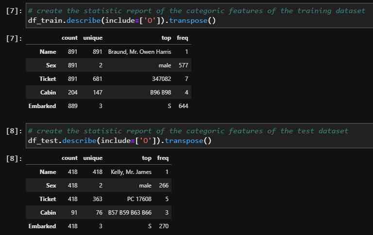
The report of the categoric features include the information of the non-empty rows, the number of unique values, the most common value as “top” and the frequency of the most common value.
- We see that all passenger names are unique but not all ticket numbers. It could be possible that children or families share the same ticket number.
- There are in total 843 male passengers 577 in the training and 266 in the test set. Because the Sex feature has only two unique values (male and female), there must be 472 female passengers, the difference between the total number of passengers in both datasets and the total number of male passengers.
- The feature Cabin has missing values (204 instead of 891 in the training dataset and 91 instead of 418 in the test dataset.
- Also the feature Embarked has missing values (889 instead of 891 in the training dataset).
Key Questions for the Data Analysis
Now let us remember our task for the Titanic competition. We want to build a classifier that predicts which passengers of the Titanic survived. The classifier must find patterns in the features to separate the passengers that survived from the passengers that didn’t survive the Titanic.
For that reason, it makes sense to dive deeper into the features of the datasets and try to find features that have an impact on the survival rate of a passenger. You could just test each feature, but I like to create some key questions that helps to clarify whether a feature is useful or not.
For every key question and for every feature, we will compute the survival rate of the passengers separated by this feature. Therefore, it makes sense to create a function that computes all this for us and use this function in every key question.
def pivot_survival_rate(df_train, target_column):
    # create a pivot table with the target_column as index and "Survived" as columns
    # count the number of entries of "PassengerId" for each combination of target_column and "Survived"
    # fill all empty cells with 0
    df_pivot = pd.pivot_table(
        df_train[['PassengerId', target_column, 'Survived']],
        index=[target_column],
        columns=["Survived"],
        aggfunc='count',
        fill_value=0)\
        .reset_index()

    # rename the columns to avoid numbers as column name
    df_pivot.columns = [target_column, 'not_survived', 'survived']

    # create a new column with the total number of survived and not survived passengers
    df_pivot['passengers'] = df_pivot['not_survived']+df_pivot['survived']

    # create a new column with the proportion of survivors to total passengers
    df_pivot['survival_rate'] = df_pivot['survived']/df_pivot['passengers']*100

    print(df_pivot.to_markdown())
The function is called pivot_survival_rate and has as arguments the training dataset and the feature that we want to analyze. In this function, we create a pivot table with the feature as index and the “Survived” label as column. We count the number of passengers for each combination of the key question feature and the “Survived” label. To count the number of passengers, we use the “PassengerId” column. Empty values are filled with 0 and we reset the index to rename our columns because we defined the “Survived” label as column for the pivot table with the values 0 for not survived and 1 for survived.
Now we can compute the total number of passengers for each attribute of the feature we want to analyze and calculate the survival rate. In the last step of the function, we print the pivot table. If you use the to_markdown function for the pandas dataframe, you get a beautiful, formatted table.
If you don’t understand every part of this function, it’s no problem, just wait after we used the function for the first time, and you see the output table.
Now let’s start with the key questions.
Had Older Passengers and Children a Higher Chance of Survival?
The first key question is: Had older passengers and children a higher chance of survival?
My main idea is to create a basic univariate distribution plot of the feature “Age” in the training data to find threshold values when the survival rate is changing, because I guess that children and older passengers had a higher survival rate compared to adults.
# create univariate dirstribution plot for "Age" seperated by "Survived"
# common_norm=False: distribution for survived and not survived passengers sum up individually to 1
sns.kdeplot(data=df_train, x="Age", hue="Survived", common_norm=False)
#sns.kdeplot(data=df_train, x="Age", hue="Survived")

# limit the x-axes to the max age
plt.xlim(0, df_train['Age'].max())

plt.grid()
plt.show()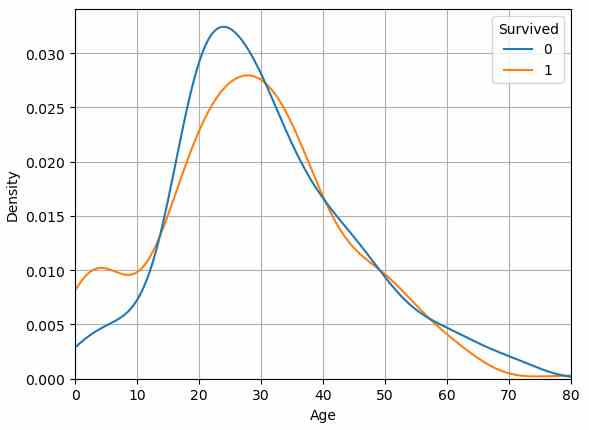
To create the distribution plot, I use the kdeplot function from the seaborn library. On the x-axis I plot the age and on the y-axis the density separated by the “Survived” label. It is important to set the common_norm attribute to false (default is true) so that each distribution for “Survived” sums up to 1.
From the distribution plot we can get the following information by comparing the differences between the line of survived (the orange line) and not survived (the blue line):
- Below 12 years, the chances of survival are higher than not to survive, especially for children around 5 years (see the peak in the survived curve).
- And if a passenger is older than the 60 years, the chance to survive reduces very fast (the gap between both curves get wider).
Computing the survival rate of each age does not make any sense, because there are too few samples for each age. That is the reason why we now create groups for the age as new feature, based on the thresholds that we found in the distribution curve.
def age_category(row):
    """
    Function to transform the actual age in to an age category
    Thresholds are deduced from the distribution plot of age
    """
    if row < 12:
        return 'children'
    if (row >= 12) & (row < 60):
        return 'adult'
    if row >= 60:
        return 'senior'
    else:
        return 'no age'

# apply the function age_category to each row of the dataset
df_train['Age_category'] = df_train['Age'].apply(lambda row: age_category(row))
df_test['Age_category'] = df_test['Age'].apply(lambda row: age_category(row))
I want to create in total three groups: children, adult and senior. Because we compute the new grouped age feature for the training and test dataset, it is handy to create a function that is basically a multi if-else query. The thresholds when a passenger is a child, or a senior are based on our knowledge of the distribution plot. We must remember that there are missing values in the “Age” feature. For these missing values we create a fourth class.
# show the survival table with the previously created function
pivot_survival_rate(df_train, "Age_category")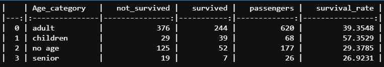
After we apply the age_category function to the training and test dataset we use our previous created pivot_survival_rate function to compute the survival rate for each age category.
From the table you see that children had a relatively high survival rate of 57% but senior passengers had a much lower survival rate of 27% compared to the mean survival rate of 38% that we got from the statistical report.
Had Passengers of a Higher Pclass also a Higher Change of Survival?
The second key question is if passengers with a higher passengers class also had a higher change of survival?
# create a count plot that counts the survived and not survived passengers for each passenger class
ax=sns.countplot(data=df_train, x='Pclass', hue='Survived')

# show numbers above the bars
for p in ax.patches:
    ax.annotate('{}'.format(p.get_height()), (p.get_x()+0.1, p.get_height()+10))

# show the ledgend outside of the plot
ax.legend(title='Survived', bbox_to_anchor=(1.05, 1), loc='upper left')

plt.show()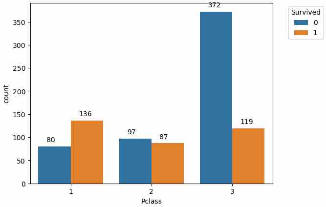
Before we compute the survival rate for each passenger class, lets create a countplot to see how many passengers survived and not survived for each passenger class. To show the numbers above the bars, we use the annotate function. get_height returns the height of a bar and by iterating over all bars, we can write the number of passengers above each bar.
From the bar chart, we see that most passengers that survived are from the 1st class, but to get the exact numbers, we use the pivot_survival_rate function again.
pivot_survival_rate(df_train, "Pclass")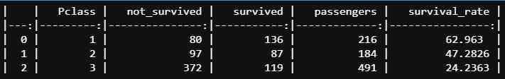
The exact survival rates from the table show that the higher the passenger class, the higher was the survival rate and that the highest survival rate had passengers in the first class (63%) compared to the survival rate of the lowest class (24%).
Did Passengers that paid a higher fare also had a higher survival rate?
We could also assume that passengers that paid a higher fare had a higher chance for survival.
To see if the fare influences the survival rate, we create a basic univariate distribution plot of “Fare” for the training data because we need the information if the passengers survived not or. For the distribution plot we use the kdeplot function of the seaborn library and separate the distribution by “Survived”.
Like for the first key question, if children and older passengers had a higher survival rate, it is important to set the common_norm attribute to false so that the distribution of each unique value for “Survived” sums up to 1.
# create univariate dirstribution plot for "Fare" seperated by "Survived"
# common_norm=False: distribution for survived and not survived passengers sum up individually to 1
sns.kdeplot(data=df_train, x="Fare", hue="Survived", common_norm=False)
plt.grid()
plt.xlim(0, 100)
plt.show()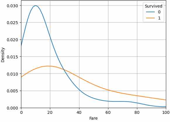
From the distribution plot we see that a fare lower than 30 results in a very low survival rate. If a passengers paid a fare higher then 30, the chance to survive was higher than not to survive.
Did women have a higher chance of survival?
From the Birkenhead Drill, better known as the code of conduct: “Women and children first”, we also must prove if women had a higher chance of survival. Because the feature “Sex” has only two values female and male, we can use our function pivot_survival_rate to get the survival rate for male and female passengers.
pivot_survival_rate(df_train, "Sex")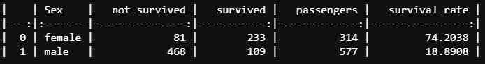
From the resulting table we see that the survival rate for female is 74% and for male 19%. Therefore, currently the feature “Sex” is the best feature for the classification algorithm, because it separates the survived passengers best from the not suvrived passengers.
Did the port of embarkation influence the survival rate?
The last key question is if the port of embarkation influences the survival rate. The corresponding feature “Embarked” has three unique values so that we can use the pivot_survival_rate function again.
pivot_survival_rate(df_train, "Embarked")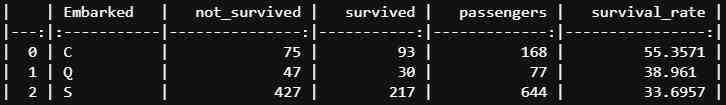
The results are the following:
- There is a difference in the survival rate between the three different ports.
- The lowest survival rate had passengers that embarked in Southampton (S) with 34%.
- The highest survival rate had passengers that embarked in Cherbourg (C) with 55%.
Try to separate Survived and not Survived Passengers
In addition to the key questions, we can create different visualizations to see if one or a combination of features separate the survived and not survived passengers. This task gives an indication which features could be important for the machine learning algorithm.
The advantage is that you can try out all features separated by numeric and categorical features in a loop. That saves a lot of time and can be fully automated. The disadvantage is that you do not think much about each feature. That can hurt you to create new features in the feature engineering part.
My recommendation is to think about some key questions, answer the key questions like we did but also compute the influence of every feature on the target variable at the end of the data analysis part, so that you are not missing some important influence.
Before we visualize the influence of all features, we combine different features that showed a high influence on the survival rate during the processing of the key questions.
Survival Rate for Sex and Pclass
The first two features are “Sex” and “Pclass”. Both features are categories, so we use the catplot of the seaborn library. Seaborn has no possibility to show the values of the y-axis in each bar of the plot. But we can use the bar_label function from matplotlib. Note that this function is only available for matplotlib versions greater or equal v3.4.2.
sns.set(font_scale=1.3)
g = sns.catplot(x="Sex", y="Survived", col="Pclass", data=df_train, kind="bar")

# loop over the three different axes crated by the col feature
for i in range(3):
    # extract the matplotlib axes_subplot objects from the FacetGrid
    ax = g.facet_axis(0, i)

    # iterate through the axes containers
    for c in ax.containers:
        labels = [f'{(v.get_height()):.2f}' for v in c]
        ax.bar_label(c, labels=labels, label_type='center')

plt.show()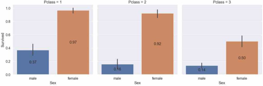
First, we loop over each of the three axis of the passenger class and extract the axes_subplot from the FacetGrid. Now we iterate for each axis container, get the number of the y-axis from the get_height function and use this number for the bar_label.
Let me know in the comments if you know another possibility to show the values of the survival rate in the chart.
From the categorial plot that shows the survival rate separated by the sex and passenger class, we get the following results:
- Almost all female passengers of the first class (97%) as well as the second class (92%) survived.
- Female passengers of the 3rd class had a higher chance of survival than male passengers of the first class -> the feature Sex has a higher influence of the survival rate than the Pclass.
- The survival rate for male passengers in the first class was more than twice as high compared to the second and third class.
- The survival rate of male passengers between the second and third class differs not much.
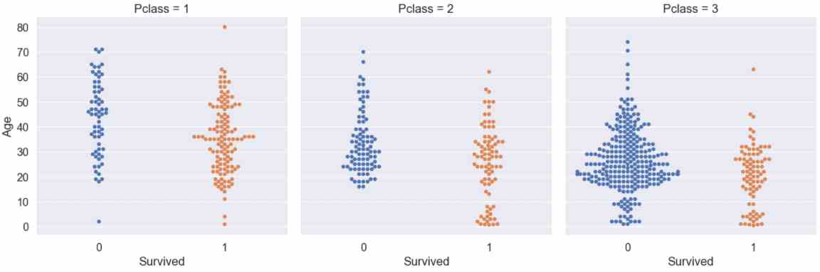
Survival Rate for Age and Pclass
We can also combine a categorical and numeric feature in a catplot by creating a swarmplott. I would like to find out if the age of the passenger in the different passenger classes has a significant influence of the survival rate.
g = sns.catplot(x="Survived", y="Age", col="Pclass", data=df_train, kind="swarm")
plt.show()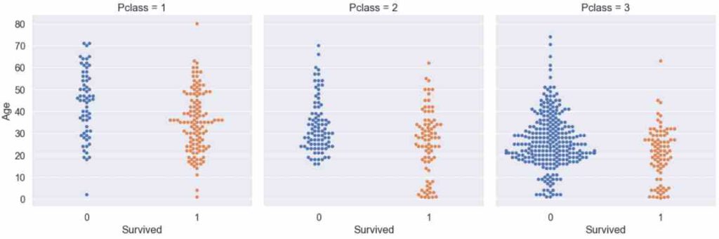
From the swarmplot we see that almost all young passengers from the first and second passenger class survived, but there are a lot of young passengers from the third class that died. The second observation is that older passengers had a higher change to survive if they are in a higher passenger class (imagine a horizontal line, starting around the age of 50).
Survival Rate for selected Categorical and Numerical Features
After we combined multiple features of the key questions, we want to visualize the influence of selected categorcial and numerical features on the survival rate.
For the categorical features we use the catplot and for the numerical features we use the kdeplot. You already know both seaborn functions from the key questions section.
For the categorical plots we use the same lines of code to create the bar labels that show the survival rate inside each category bar.
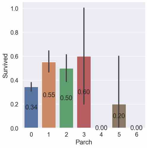
for feature in ["Sex", "Embarked", "Pclass", "SibSp", "Parch"]:
    g = sns.catplot(x=feature, y="Survived", data=df_train, kind="bar")

    # extract the matplotlib axes_subplot objects from the FacetGrid
    ax = g.facet_axis(0, -1)

    # iterate through the axes containers
    for c in ax.containers:
        labels = [f'{(v.get_height()):.2f}' for v in c]
        ax.bar_label(c, labels=labels, label_type='center')

    plt.show()


for feature in ["Age", "Fare"]:
    g = sns.kdeplot(data=df_train, x=feature, hue="Survived", common_norm=False)
    plt.show()
You already know the results for the first three categories “Sex”, “Embarked” and “Pclass” from the key questions. Only the results of the features “SibSp” and “Parch” are new.
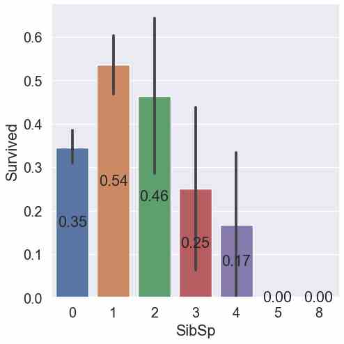
- For “SibSp” the highest survival rate had passengers with 1 sibling or spouse (54%). The second highest survival rate had passengers with 2 siblings or spouses (45%) but the confidence interval gets very wide. Therefore, the reliability of the results gets weaker.
- For “Parch”, passengers with 3 parents or children had the highest survival rate (60%) but with a wide confidence interval. Therefore, the result of passengers with 1 parch with a slightly lower mean survival rate (55%) but also with a narrower confidence interval is more reliable.
Save the Analyzed Dataset
The last step in the data analysis Jupyter notebook is to save the training and test dataset as pickle files.
df_train.to_pickle('df_train.pkl')
df_test.to_pickle('df_test.pkl')
In the next article we will cover the data cleaning and preparation process, where you learn among other important things which additional features I created and how to deal with the missing values in the datasets.
If you liked the article, bookmark my website and subscribe to my YouTube channel so that you don’t miss any new video.
See you next time and in the meantime, happy coding.